Choosing a Warm Neutral Palette That Still Feels Luxurious
Warm neutrals are having their moment, but how do you keep a beige-forward palette from feeling dated? We share our secrets for creating sophisticated warmth.
The resurgence of warm neutrals marks a welcome departure from the cool grays that dominated interiors for over a decade. But warm does not mean beige by default—the spectrum of possibilities is far richer than that.
The key to a luxurious neutral palette lies in undertones. A warm white with peachy undertones feels vastly different from one with golden or terracotta notes. Understanding these subtle differences transforms a flat palette into one with depth and sophistication.
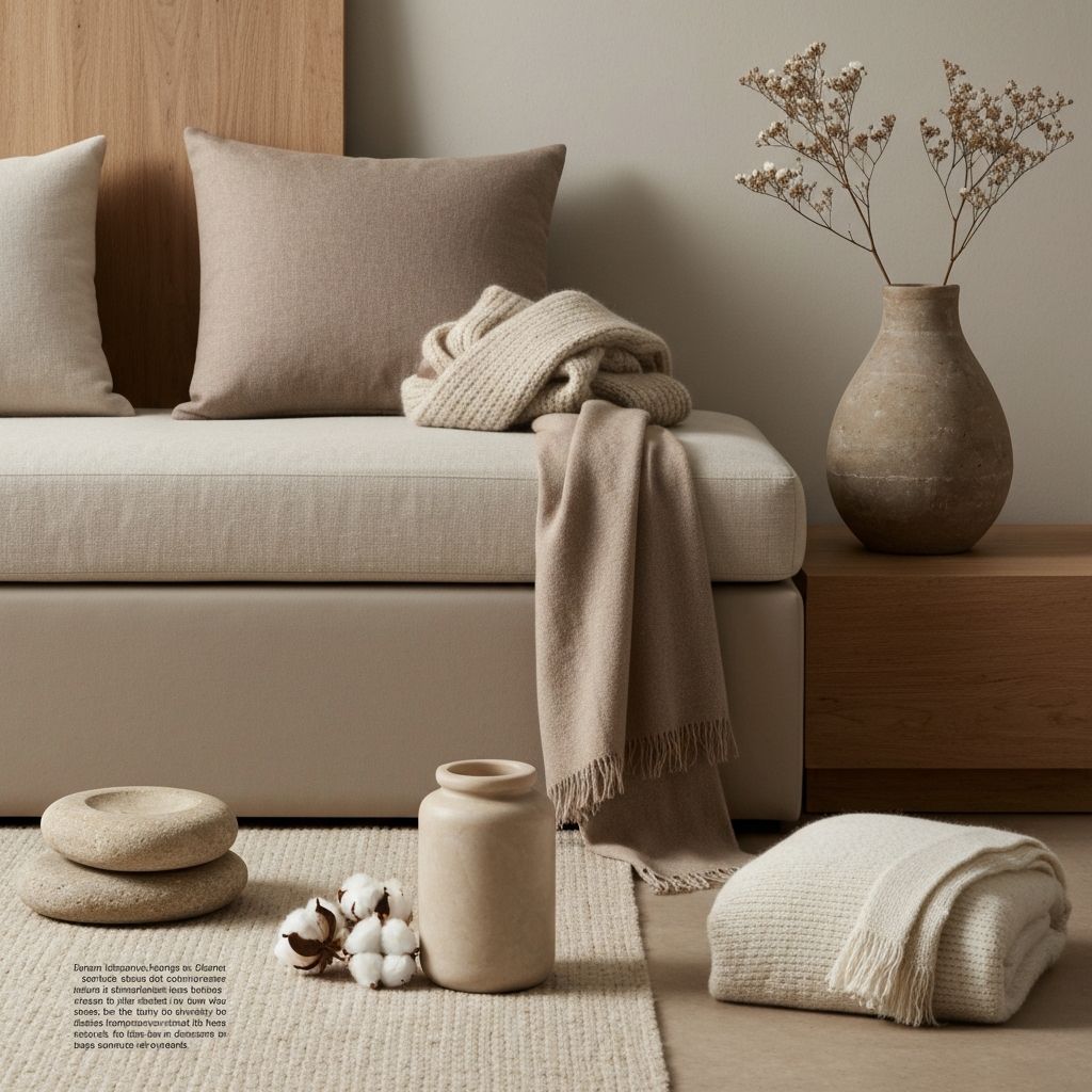
Layer your neutrals intentionally. A room painted in a single warm beige will feel flat, but introduce variations—cream, sand, camel, mushroom—and suddenly the space has dimension. Each shade should relate to the others while maintaining its distinct character.
Texture becomes essential in a neutral palette. Without color contrast to create visual interest, materials must do the work. Think linen against velvet, matte plaster against polished wood, rough ceramics against smooth marble.
Introduce intentional contrast through tone, not necessarily through color. Deep espresso or charcoal accents grounded against cream and taupe create sophisticated tension without introducing competing colors.
Natural materials are your greatest allies in warm neutral spaces. Wood, stone, rattan, and natural textiles bring inherent warmth and variation that synthetic materials cannot replicate. Let nature do some of the design work.
Finally, consider how light transforms warm neutrals throughout the day. Morning light may cool your palette while evening light amplifies warmth. Choose colors that perform beautifully across the full range of natural light your space receives.
Ready to transform your space?
Let us bring these principles to life in your home. Book a consultation to begin your design journey.